
🗣️ PTE Academic: Describe Image – Travel Time to Work (Pie Chart)
In the PTE Speaking section, "Describe Image" is a key task that tests your ability to quickly analyze and speak about visual data. One common type is the pie chart. Let's practice using a real example: Travel Time to Work in Ontario, 2016.
Template:
The image provided is a _______ that gives information about _______.
While x axis talks about _______, y axis talks about _______
(only for bar graph, line graph and area chart)
It is evident that _______.
Conversely, _______.
Another interesting point is _______.
"Overall, this image illustrates _______."
🥧 Sample Pie Chart:
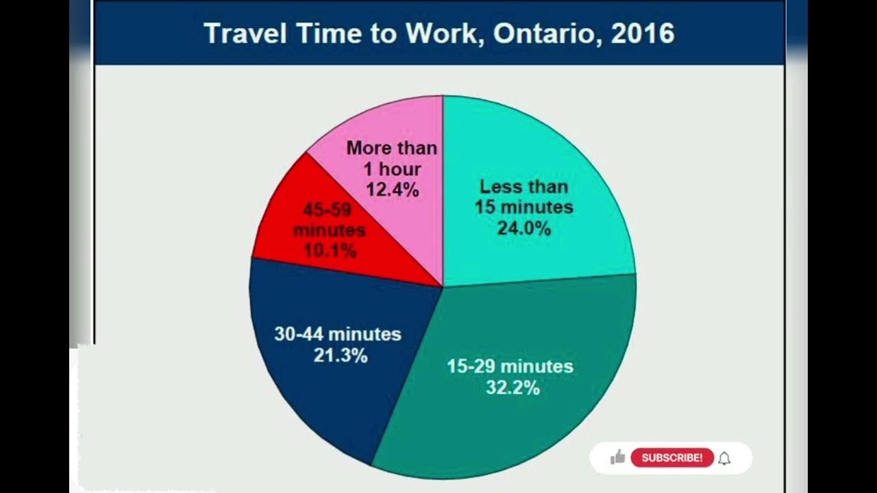
This pie chart shows the percentage of people in Ontario in 2016 based on how long they took to travel to work.
📝 Sample Answer Using Template:
Introduction:
The image provided is a pie chart that gives information about how long people in Ontario took to travel to work in 2016.
While x axis talks about ________, y axis talks about ________
(Note: This line is only applicable for bar graph, line graph, and area chart.)
Main Details:
It is evident that the highest percentage of people, 32.2%, traveled for 15 to 29 minutes.
Conversely, only 10.1% of people spent 45 to 59 minutes commuting.
Another interesting point is that 24% of workers had a commute of less than 15 minutes, while 21.3% took 30 to 44 minutes, and 12.4% traveled for more than an hour.
Concluding Summary:
"Overall, this image illustrates a wide range of commute times in Ontario, with most people spending less than 30 minutes traveling to work."
🗣️ PTE Speaking Tips:
-
Use a clear structure: Introduction → Key Details → Conclusion.
-
Don’t pause too much—speak fluently, even if you paraphrase.
-
Focus on numbers and trends—you don’t need to mention everything, just the key points.
-
Practice with a timer—you only get 25 seconds to prepare and 40 seconds to speak.